When your brand identity consists of multiple complex strands, partnering with OTM can lead to simplicity and unity.
From complexity
to cohesion

We love it when a brand comes together.
The seeds of our relationship with Guardian, the world’s leading independent fall protection and prevention brand, began long before we worked with them. It was encouraging that a long-standing client moved to a senior role at Guardian and wanted to continue the trusted relationship with OTM on a fresh set of challenges.
The seeds of our relationship with Guardian, the world’s leading independent fall protection and prevention brand, began long before we worked with them. It was encouraging that a long-standing client moved to a senior role at Guardian and wanted to continue the trusted relationship with OTM on a fresh set of challenges.
When failure isn’t an option
Fall protection and prevention is inherently complex, with a wide range of sophisticated products that have multiple applications across different industries. It’s also a high-stakes business, where working environments are at their most demanding and users’ lives are quite literally on the line.
In Guardian’s case, this complexity was compounded by the extensive rationalisation of a huge product range across a number of brands. This now had to be seamlessly integrated beneath the new main brand.
In Guardian’s case, this complexity was compounded by the extensive rationalisation of a huge product range across a number of brands. This now had to be seamlessly integrated beneath the new main brand.
Simplifying, unifying and elevating the Guardian brand
Bringing together all these disparate strands (product and service information, brand proposition, design collateral etc) drew on many aspects of our multi-disciplinary toolkit, as well as our partnership-based approach to working with clients. The result was a series of interwoven workstreams delivered against considerable time pressure. These included:
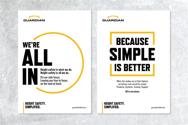
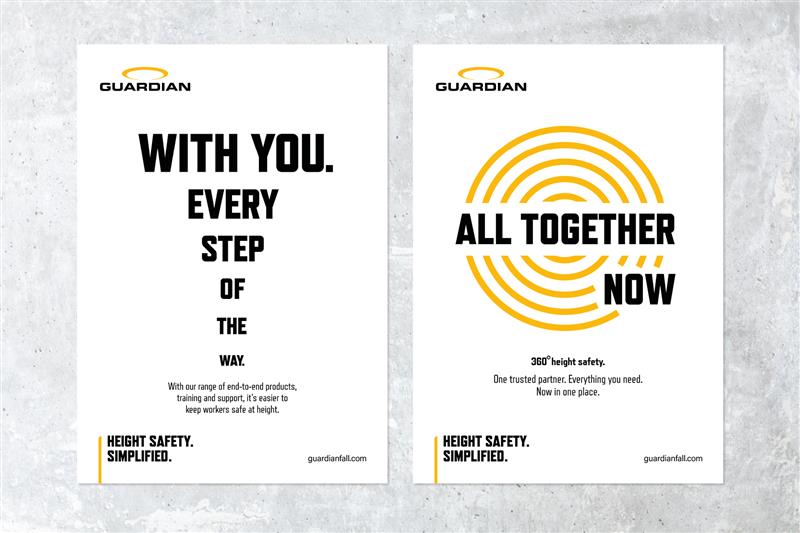
- Taking Guardian’s highly focused new positioning, “Height Safety. Simplified”, and bringing it to life in a consistent, vivid and dynamic way across a range of media.
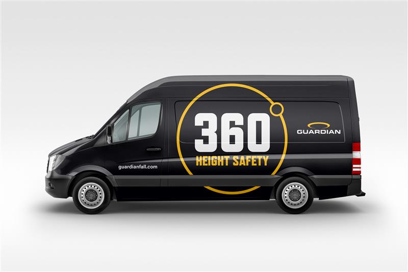
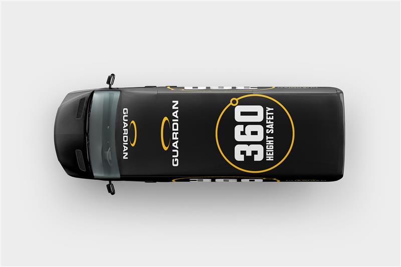
- Distilling Guardian’s vast international suite of products, services and training courses down to a simple, accessible “360-degree” model that’s easy to understand and navigate.
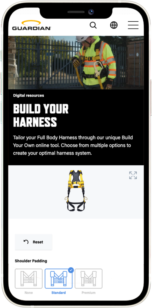
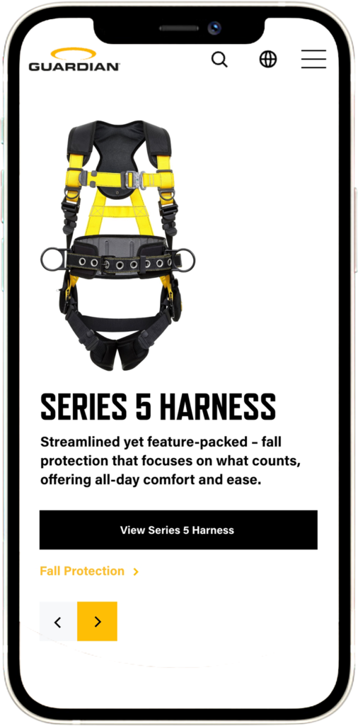
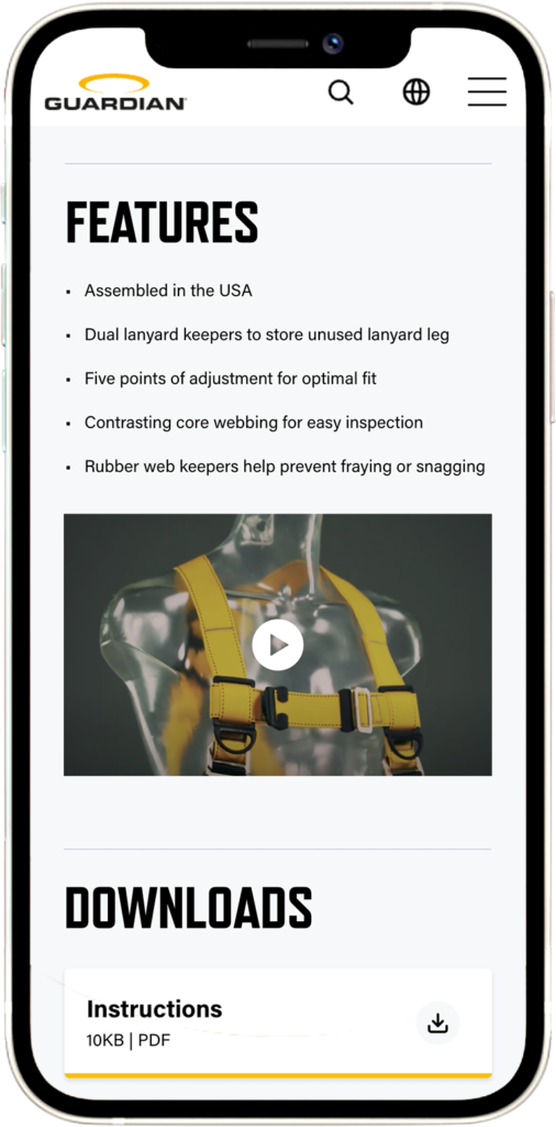
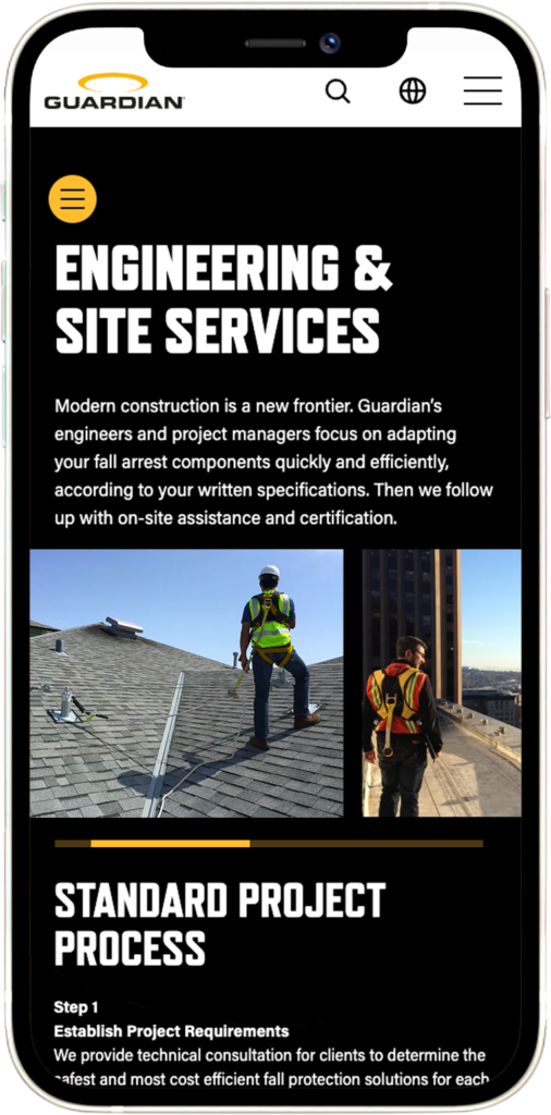
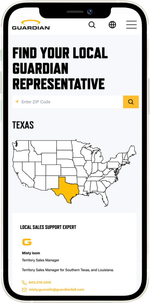
- Comprehensively re-working the structure and UX of Guardian’s website to fully embody the theme of “simplifying complex decisions”. This entailed a total redesign of the content management system and a streamlining of the customer’s online experience, from initial exploration to product customisation, size measurement, course booking and final purchase, as well as easy connection to local experts and support teams.
- Creating digital “mobile-first” tools to further fine-tune the purchase of custom safety equipment, calculate safety measurements and output safety-critical data instantly.
- Producing a powerful, conceptually innovative brand film to convey the “Height Safety. Simplified” theme in a way that roots it firmly in the day-to-day experience of Guardian customers.
- Simplifying the iconic Guardian logo to create a production-friendly re-badging ideal for the newly-organised range of safety equipment. This provided practical, cost-effective solutions for branding and manufacturing using an array of materials and substrates from rubber and steel to fabric and plastics - the ‘physical brand’ brought to life.
This has been a uniquely satisfying project, and a great example of how trusted partnerships, deep expertise and a holistic, multi-stranded but aligned approach can breathe life into the most complex of propositions.
guardianfall.com
guardianfall.com
The team at OTM was invaluable in masterminding the relaunch of Guardian’s new brand and website. They worked seamlessly with our teams in both the UK and US and were always on hand to guide us through the brand transformation – offering valuable advice, insights and expertise, and delivering a world class website, we are all extremely proud of. Thank you, OTM!– Tony Merlini, Global Creative Director, Guardian
Guardianfall.com by the numbers:
42
User/customer interviews
211
Individual page designs
432
Product pages
6,860
Fall Clearance calculations
791
Testing logs
4
Regional web experiences
1
Headless CMS
1
Global brand
