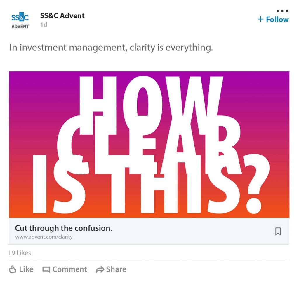
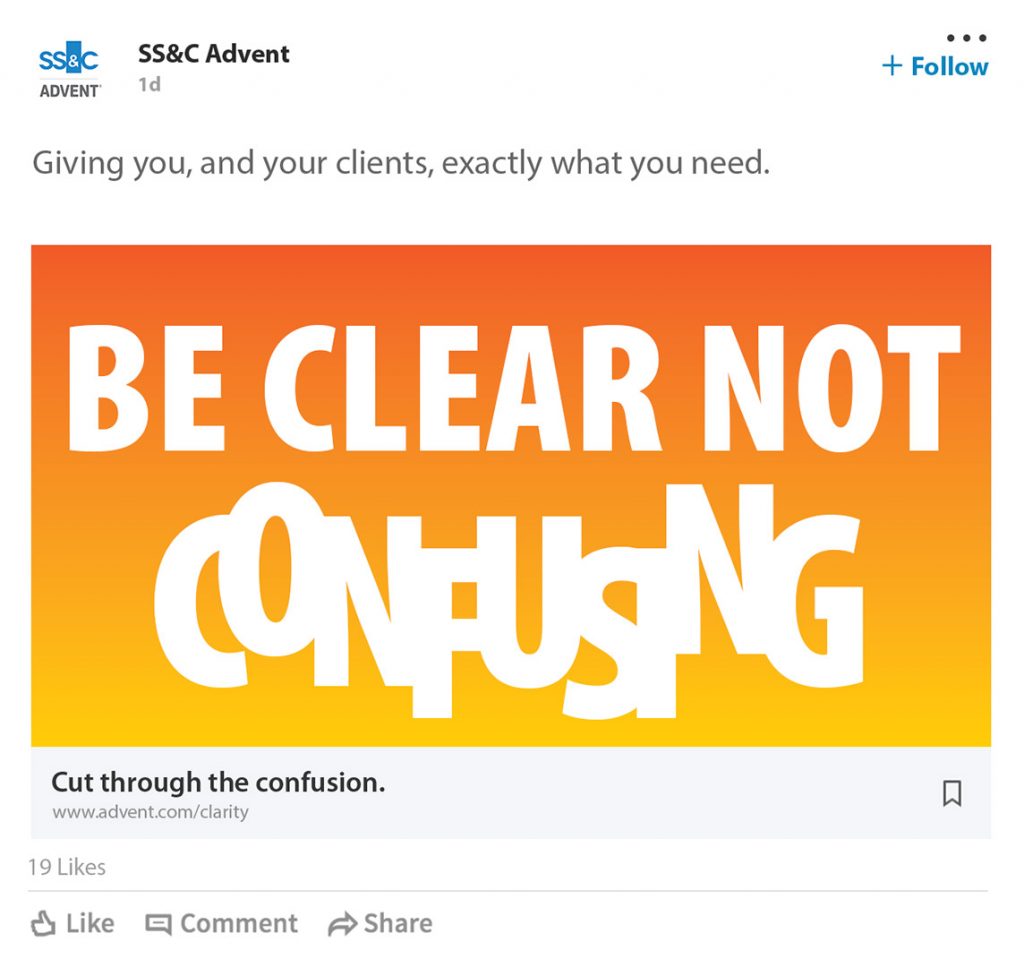
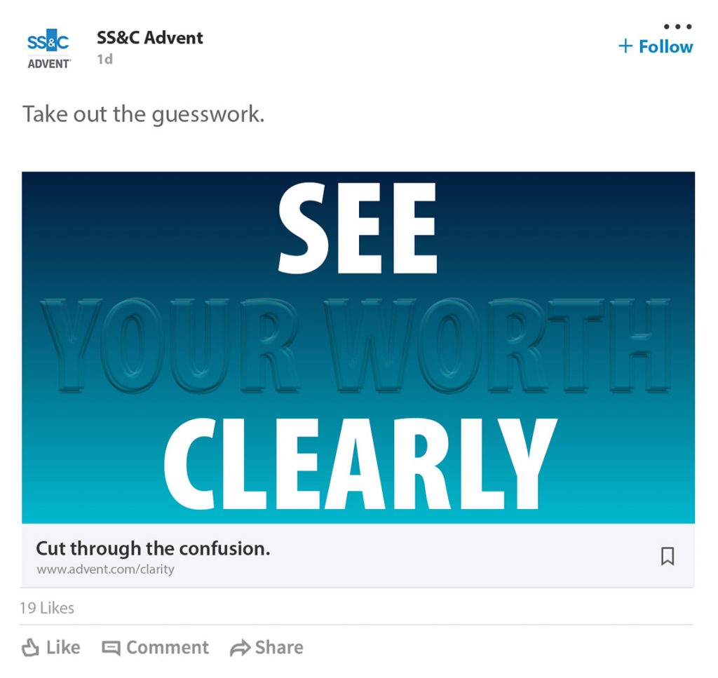
How audience-driven web design enhanced SS&C Advent’s status as an industry thought-leader.
Web of influence.

When SS&C Advent engaged us to redesign its website, the global fintech firm had more in mind than just a fresh look and feel.
The new site would play a pivotal role in positioning Advent as a thought leader and innovator in the complex field of financial services technology, which meant the redesign had to be fuelled by a deep understanding of the diverse audiences the company wanted to reach.
The new site would play a pivotal role in positioning Advent as a thought leader and innovator in the complex field of financial services technology, which meant the redesign had to be fuelled by a deep understanding of the diverse audiences the company wanted to reach.
Audience-led design
Our team began with a detailed audit of the original site, identifying key design themes and user journeys that needed enhancing and reimagining. We also liaised with client teams around the world to identify different types of user, before interviewing members of each audience segment to map their needs and expectations. This complex yet rich feedback was then carefully analysed and translated into a powerful set of design principles.



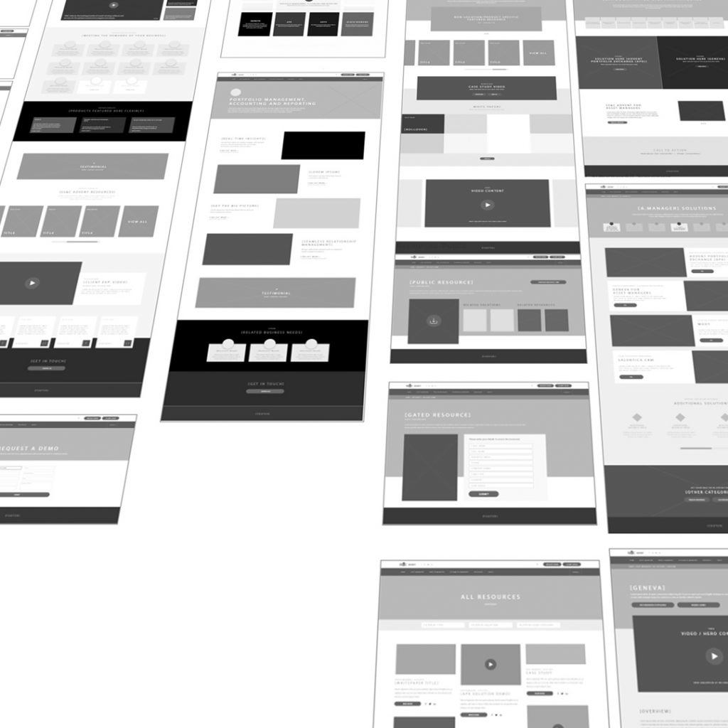
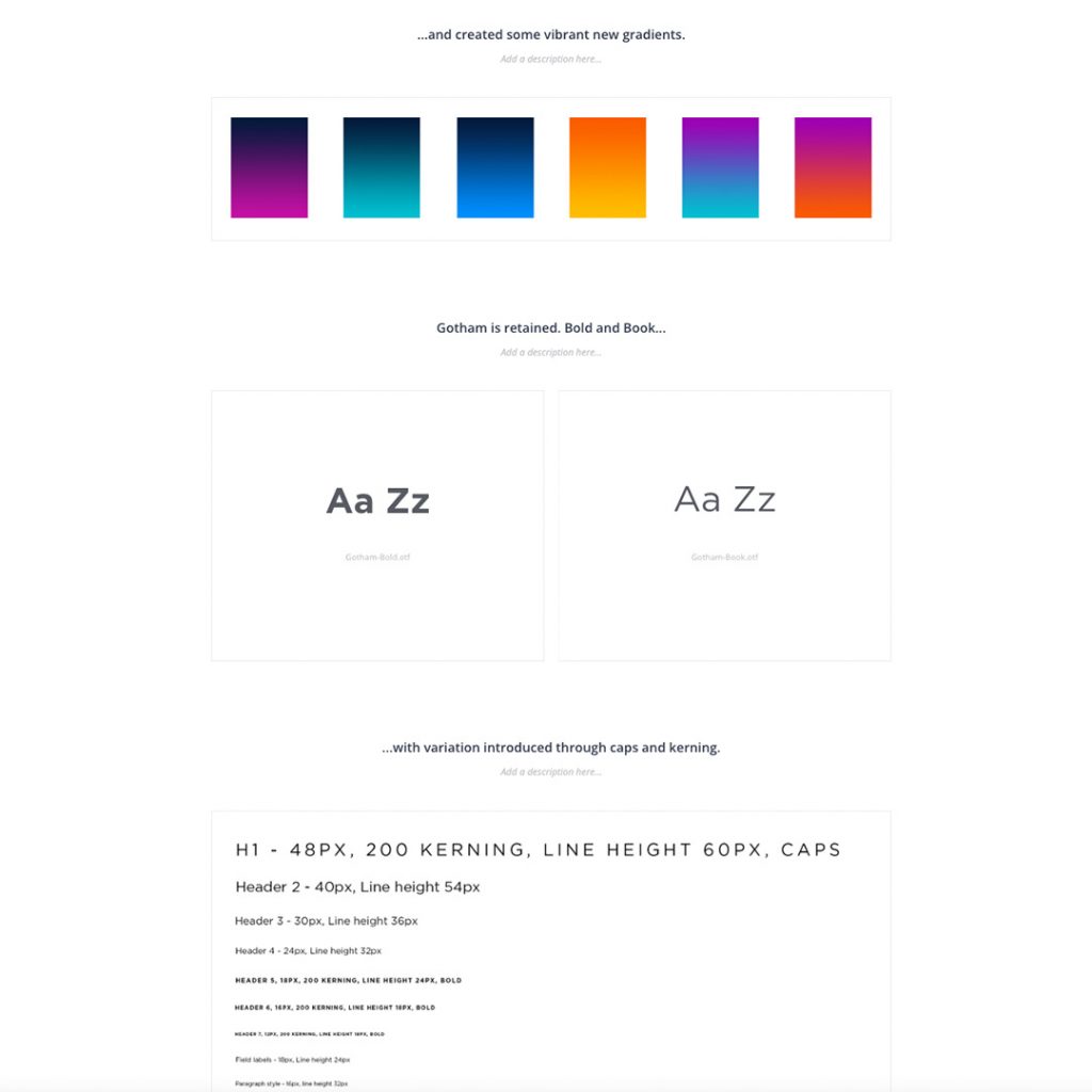
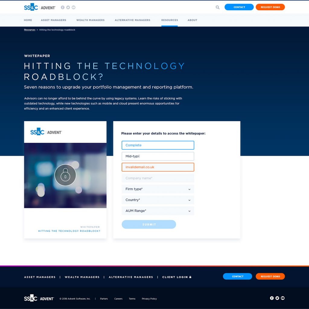
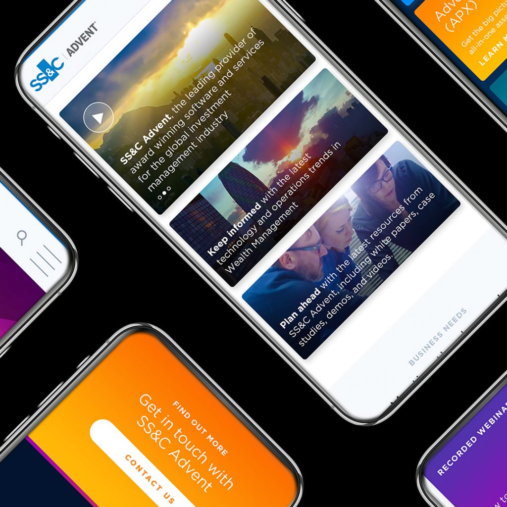
The result was a complete redesign package ready for hand-off to Advent’s developers, including bespoke iconography, fully functioning InVision desktop designs, mobile layouts and optimised imagery. The “less is more” aesthetic creates clarity, ease of navigation and an element of personalisation for different user groups, while showcasing the richness of Advent’s product range and thinking.

